Smart Fuel Finder

Fuelup

Problem

In 2022, Sri Lanka faced a worsening fuel shortage. The absence of an effective communication system left people unaware of fuel availability and delivery schedules at filling stations. As a result, many spent hours in long queues, often without any certainty of obtaining fuel. This situation led to severe congestion in urban areas and caused a significant loss of valuable time and productivity.

Solution

A mobile application will offer an intuitive map displaying filling stations with real-time fuel availability based on user-defined criteria. Users can conveniently reserve various fuel types for multiple vehicles and receive timely notifications when fuel arrives at the selected stations within the expected refueling window.

Design Process

The design phase begins with Discover, where user interviews help gather insights. In Define, user personas and empathy maps are created to clarify needs. Ideate focuses on developing user flows, followed by Design, which involves wireframing and visual design. Finally, Test gathers feedback to refine the solution.

01 Discover Phase

I conducted online interviews with 10 participants through social media platforms to better understand their experiences during the ongoing fuel shortage. The primary goal was to learn how they currently obtain fuel, the strategies they use, and the specific challenges they face throughout the process. These insights helped uncover pain points and areas for potential improvement. A few example questions from the interviews are presented below.

  • What is your name?

  • What is your age?

  • What is your profession?

  • Where are you located?

  • On average, how many hours do you spend waiting in line to get fuel?

  • How do you usually find a filling station that has the type of fuel you need?

  • What methods do you use to check fuel availability?

  • Are you willing to drive long distances to refuel your vehicle?

  • Do you always prefer the closest filling station?

  • How do you feel when you have to wait in line for a long time?

  • Do you often search for more than one type of fuel at the same time?

  • Do you have a preferred filling station where you regularly refuel?

  • Would you be comfortable reserving fuel online if such a tool were available?

Key Insight Derived From User Interviews

  • Before the crisis, most people preferred specific refueling stations.

  • Since the crisis began, proximity has become the primary factor in choosing a refueling station.

  • Many people spend hours waiting in long queues to get fuel.

  • Prolonged waiting has led to various health issues.

  • There is significant interest in a convenient online solution for managing fuel needs.

02 Define Phase

empathy map helps visualize the experiences of users facing challenges in obtaining fuel. It captures what users say about their frustrations, what they think regarding the fuel shortage, what they do to find fuel, and how they feel during the process. This tool helps identify pain points and gain a deeper understanding of user needs, guiding the design of more effective solutions.

Says

  • I try to fill up as quickly as possible.

  • I’m constantly searching for a shorter line.

  • An online solution would be easier for me.

  • Is there a way to know when fuel is available?

Think

  • Which filling station is closest to me?

  • How long is the queue at this station?

  • Is the station’s fuel supply sufficient?

  • How much longer will I have to wait in line?

Feel

  • What if I wait in line for a long time and still can’t get fuel?

  • Are the updates on social media reliable?

  • How can I easily locate a filling station with fuel?

  • How will I choose the right filling station to get fuel?

  • What if the amount of fuel I receive is less than expected?

Empathy Map

  • I frequently check social media for fuel updates.

  • I spend a lot of time in line to acquire fuel.

  • I ask family members for fuel when it’s urgently needed.

  • I regularly check the availability of fuel at the nearest filling station.

  • Due to the fuel shortage, I avoid using my personal vehicle for long-distance travel.

User Personas

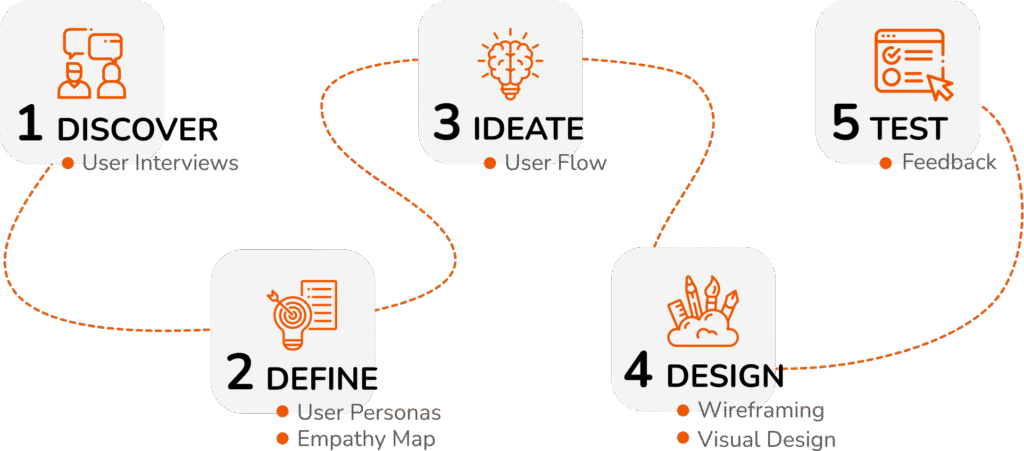
Based on the insights gathered from the user interviews, I created a detailed user persona to help inform and guide the design process. This persona represents the typical user, their goals, challenges, and behaviors, ensuring that the design decisions are aligned with their needs and preferences. By developing this persona, I aimed to create a more user-centered solution that addresses the pain points highlighted during the interviews.

Name –  Tharu De Silva

Profession – Architect

Age – 30Years

Gender – Female

Location – Rajagiriya

Tharu is an Architect. She has five days of duty in her workplace and she has been involved in site visits to her office duties & freelance work. She always tries to travel with her family at least two times per month. Since she uses her own car, she requires more fuel to travel.

Goals

  • Easily find filling stations while driving.

  • Get fuel quickly and save time.

  • Requires an online service for convenience.

  • Wants to know the expected arrival time of fuel at the filling station.

Pain Points

  • Struggling to find filling stations with available fuel.

  • Waiting for more than 24 hours in line to refuel.

  • There is no effective way to communicate fuel availability.

  • Due to a busy schedule, there’s no extra time to spend waiting in fuel queues.

03 Ideate

User Flow

I created a detailed user flow to visually represent the path a user would take through the application in order to achieve their goals. This flow outlines each step, from initial interactions to completing tasks, ensuring that the user experience is intuitive and seamless. By mapping out the process, I was able to identify key touchpoints and potential obstacles, allowing me to refine the design for better usability and efficiency. The user flow serves as a blueprint for guiding users through the app in the most efficient and user-friendly way.

04 Design

Wireframes

I started by sketching low-fidelity wireframes on paper to quickly explore the basic structure and layout of the application. Once I had a clear direction, I developed higher-fidelity wireframes, adding more detailed elements such as content placement, buttons, and navigation. These wireframes served as a blueprint for the app’s functionality, allowing me to focus on how users would interact with different screens.

Typeface

Visual Design

After finalizing the wireframes, I moved on to the visual design phase. Here, I focused on enhancing the app’s aesthetic, choosing color schemes, typography, and iconography that align with the brand and improve the user experience. This phase brought the wireframes to life, ensuring the design was not only functional but also visually appealing and user-friendly.

Home
About
Projects